Perle Creative were engaged to design the new brand, logo and styleguide for Q Dermatology. We were lucky enough to collaborate with the Graphic Designers at Perle Creative to extend their brand concept into the signage and wayfinding elements of the fitout, clearly communicating the strength of this brand.
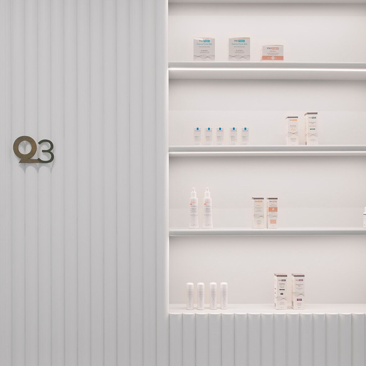
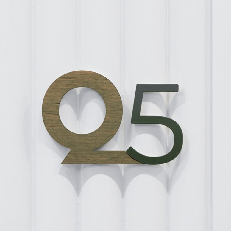
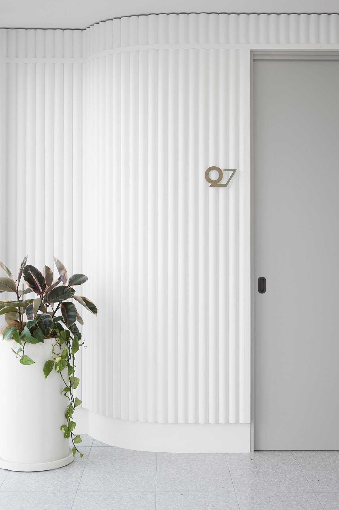
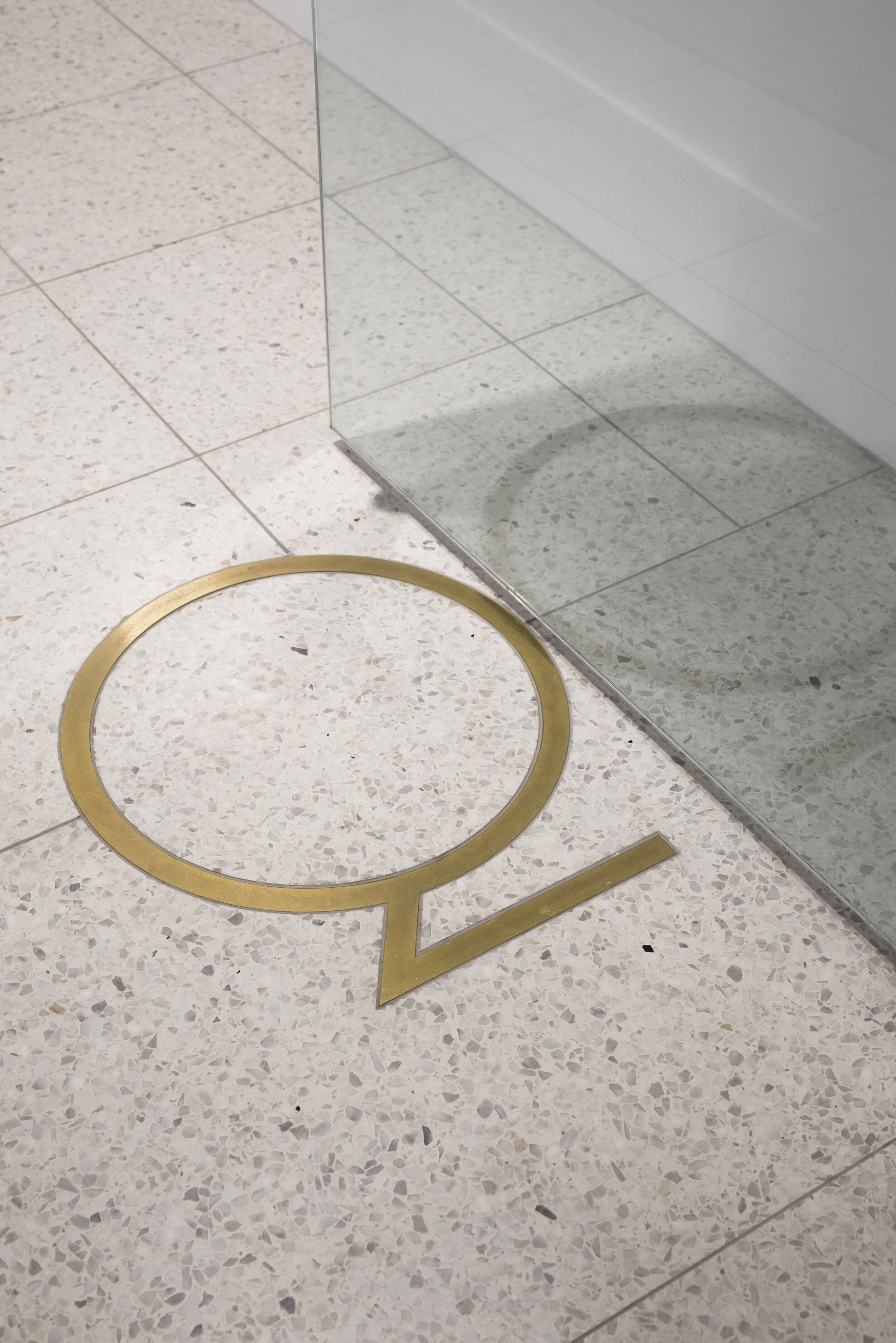
Our client had a strong desire to capture the ‘Q’ logo within the fitout and we saw an opportunity to integrate this within some of the key design elements such as the brass inlay into the tiled floor at the entrance, embossed into the upholstered seat cushions and used as signage to identify each treatment room. This thoughtful yet intuitive reinforcement of the brand ensures the Q Dermatology brand feels established, creating a sense of trust for patients.