We recently worked on a project within a large, well established retail environment. The client had already completed areas of significant refurbishment and new build, to elevate the offerings at the shopping centre and attract tenants and users. We were tasked with developing a concept to upgrade and energise an older part of the centre which was now more accessible and showing its age being directly linked to the newly completed areas. This zone included medical and various social services offices so we wanted to ensure wellbeing, safety and cleanliness was also embedded into the design.
Part of the brief required us to help the client determine what could be done, at what cost and within what timeframes. We worked up a series of options which could be built upon from minimum expenditure, through medium, to a proposed maximum. The key to the design solution was the use of a consistent design language to unify this long linking area which stretched over 500m with various elements of vertical transport and carpark connection points. This consistency of design elements also extended to finishes and the integration of verdant sub-tropical planting.
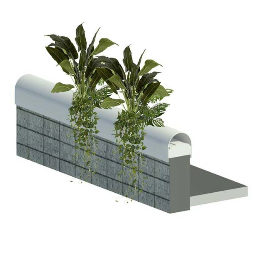
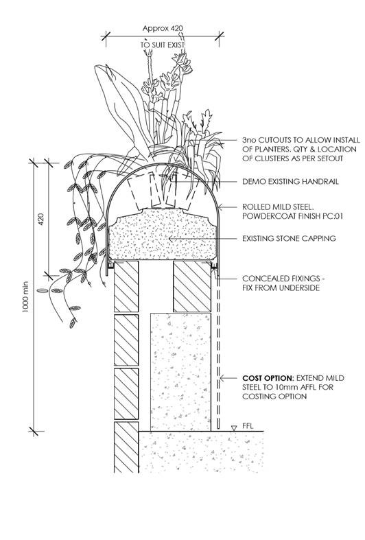
An example of the design elements we created in order to bring all areas together to form a single cohesive experience and zone, is the powdercoated metal sleeve detail which is installed over the existing blockwork balustrade, integrating planting and creating a softer aesthetic, with ease of cleaning and maintenance in mind. This element is repeated along various points reinforcing the extent of this zone and connecting other elements which included door portals and the stair planter grids…all based on a simple geometry, palette and materials.